6 Things That Could Be Improved in Azure DevOps Pull Requests

I have been using Azure DevOps as a poor man’s GitHub repository management software for almost a year, and there are several things I’ve noticed about its pull request features that are inefficient, misleading, or just bad UI. These are all things that GitHub does perfectly, and could be improved in Azure to make the code review process easier for developers:
Commit linking in PRs could be better. When you click on a commit in a PR, any comments added here do NOT get added to the PR. Instead, they get added to the commit! Who’s going to look back at a commit to check for comments? GitHub was smart enough to open the commit in context, so your comment gets added to the PR, not the commit, which no one would ever check. I open commits in PRs to see the latest changes after my initial review, and often I will need to add comments on the latest changes. Well, I can’t do that with ADO.
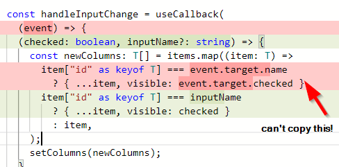
You can’t copy deleted code in some diffs. Sometimes I will delete something in a PR and realize I shouldn’t have, so now I want to re-introduce that code. So, I go into the PR and click on the file I deleted the code from, and thanks to ADO, I can’t copy any deleted lines here. However, in the initial diff (without the file path query parameter), you CAN copy deleted lines. What’s the purpose of making it harder to copy code in the single-file diff? Thanks a lot, Microsoft.
Doesn’t save drafts. It doesn’t save drafts when you enter a PR title and description, so if you accidentally navigate away, those notes you left in the PR are now gone. Conversely, GitHub saves your PR title and description in a draft when you navigate away.
Misleading scroll bar in large diffs. In a PR diff, the scroll bar is unrealistically optimistic. If my PR has 300 files changed, and I scroll down through 5 files, the scroll bar will appear to be 50% down the page. As you scroll down in large diffs like this, the scrollbar decreases in size when you keep getting to the “bottom” of the scrollable area. It’s misleading and annoying when you have a huge PR that you need to review, because the UI makes you think you’re close to the end, but you’re not. In contrast, GitHub’s scroll bars are truthful after scrolling down a few files in the PR.
Getting stuck in the file diff. When you click on a file in a diff (Files tab), it opens a full view of the file, which is a less compact diff that is useful sometimes, but it’s not ideal for reviewing code. That’s not the problem though. When this diff is activated, If I click on Overview, I’m still stuck in the file diff! I have to remove the
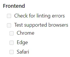
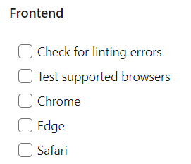
?pathquery string from my address bar manually, then I get the original diff view back. What a poor experience. In GitHub, when you click on Conversation (the equivalent of the Overview tab), it removes the query parameters.Markdown oddities. Some basic markdown features simply don’t work. One example is nested checkboxes - they don’t have any indenting when viewing a published PR. Yet, nested checkboxes do work before you create the PR, in the preview area:
Preview:
Published PR View:
I don’t expect this blog post to trigger any change or improvements in Azure. These are simple gripes with the software that I wanted to pose as potential improvements. Perhaps one day, they will be addressed, but I am not holding my breath. Overall, ADO is not bad repository software, but it does make me wish I was working with GitHub.


